https://www.instagram.com/lacantinadelsocial_rocha
Der Kunde
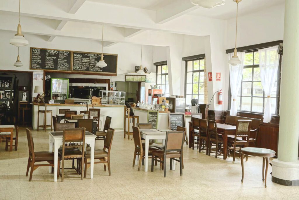
La Cantina ist ein Café, eine Bar und ein Restaurant in der Bezirkshauptstadt Rocha. Mit seiner außergewöhnlichen Lage am zentralen Platz, dem ehrwürdigen historischen Gebäude, seiner Vergangenheit als „Club Social de Rocha“ und dem innovativen Team, das für eine besonders angenehme Herzlichkeit und exzellente, originelle Küche sorgt, hebt es sich in vielerlei Hinsicht vom traditionellen lokalen Angebot ab, ohne dabei seine Wurzeln zu verlieren.
The management asked me for a complete visual redesign to complement the professionalisation in many areas after the establishment phase.


Visuality
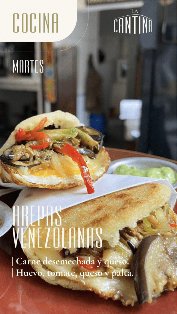
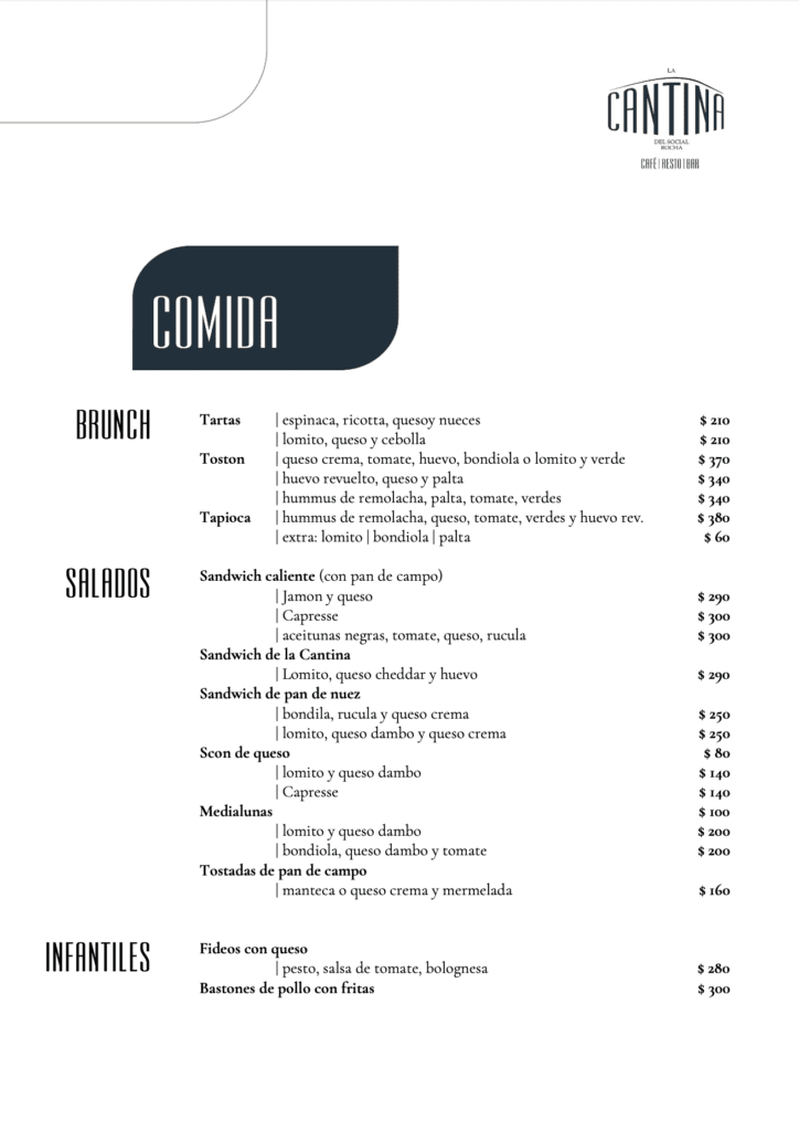
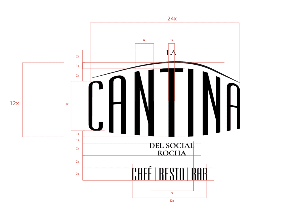
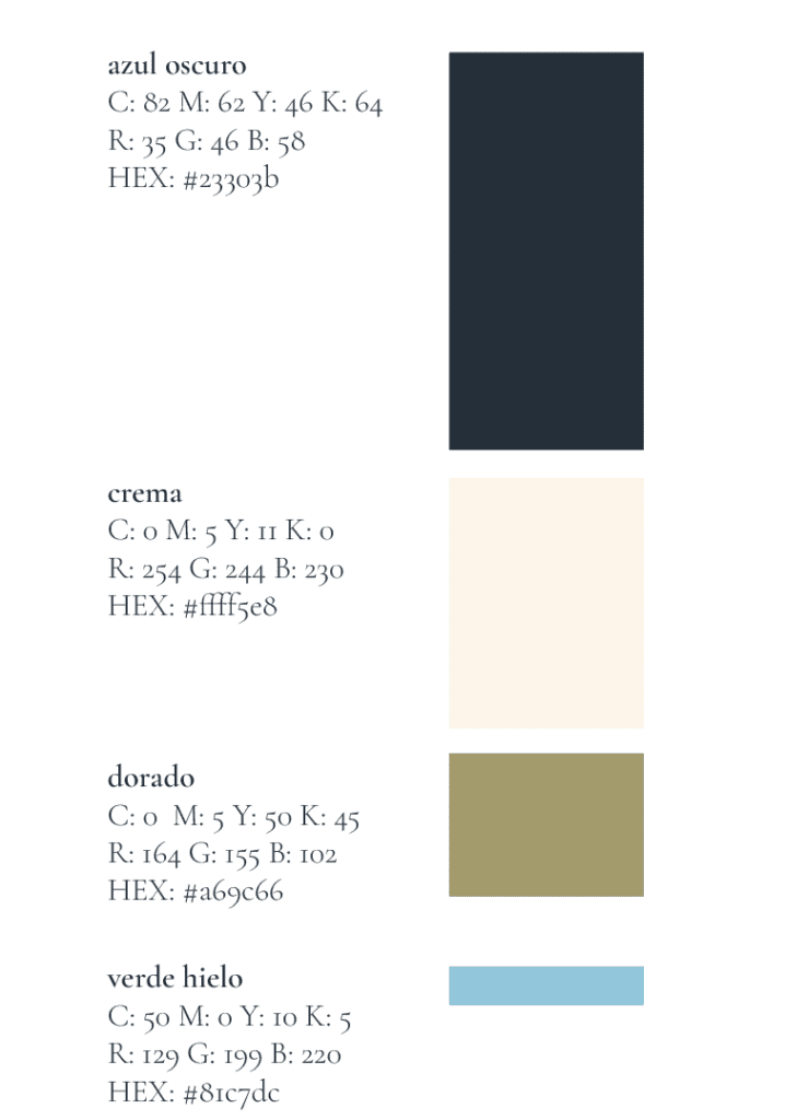
The challenge, as is so often the case, was first to identify and define the customer’s strengths and weaknesses. A detailed market analysis paved the way for a characterisation that forms the basis for an independent and effective external impact. The typography, colours, shapes and logo are largely based on the historical character of the building, which corresponds strongly with the atmosphere, target group, offer and self-perception as quiet, special, high-quality, sophisticated and innovative. Soft colours, fine lines, art deco typography and logo complement the basic idea of the rounded façade as a stylistic element and form of recognition in all the facades.
Products
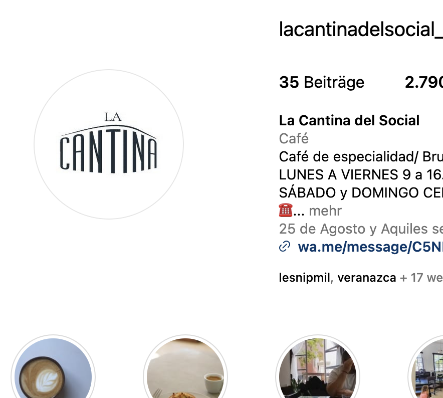
Implementation is taking place step by step. In addition to the menu card and the external impact through offer boards, the social networks were adapted and the offers and events communicated using appropriate templates. The façade design, flyers and posters, price displays and plans for an interior design adaptation are already in the drawer.