Design and build an EscapeRoom. And of course all the advertising materials.

The special thing:
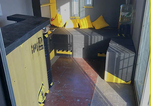
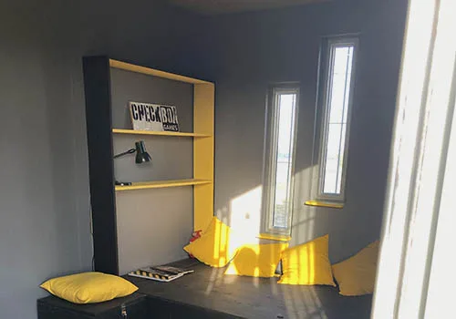
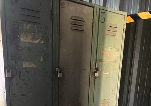
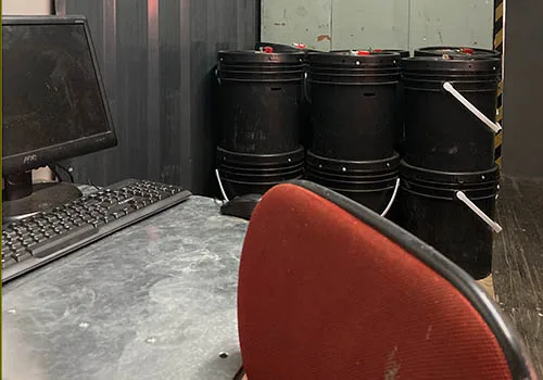
The idea was born, and it became reality. Imagining an escape room is one thing, but realizing it in all its facets is another. It took a year to design the game, procure the materials and make it playable. With a great story and – as always when something is simple – a great design based on it, the realization of all the promotional materials was a joy.
Client
Even though I am the client myself, the business analysis plays one of the biggest roles at the beginning. Asking yourself the questions is more than just an exercise. It is a duty. CheckBoxGames is intended to be a company with mobile games in the future. It should never be reduced to an escape room. As a long-time scout, I have a lot of experience in designing games for all age groups and I could imagine supplementing the initial EscapeRoom with other offerings at some point. The name should therefore be descriptive, but open, concise and cross-linguistic, but universally valid. CheckBoxGames is all of this. It captures the essence of an escape room, but leaves it open to other games. It describes the mobility, the motivation to complete something and can be understood by Spanish, German and English speakers.
Products:
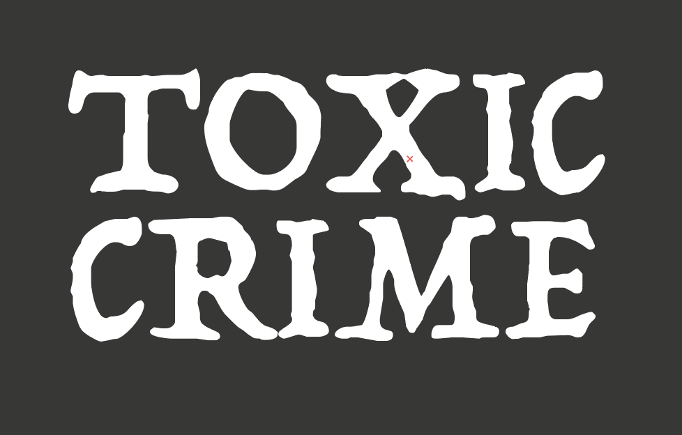
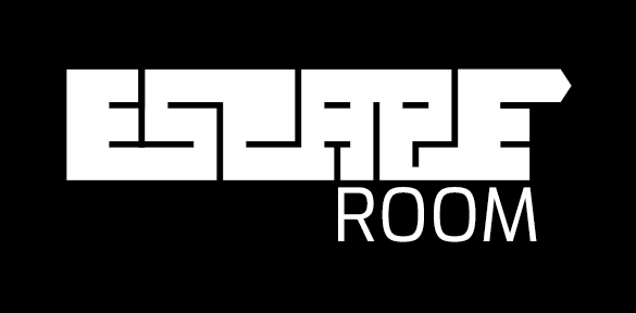
The logo should visually reinforce the expressiveness and aspects of the company. Basically, several logos and visual symbols were created: “CheckBoxGames”, “ESCAPERoom”, “ToxicCrime” and the box with a tick. No description is needed here, because their meaning is clear and can be deduced by everyone.


Visuality:
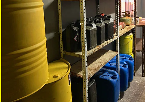
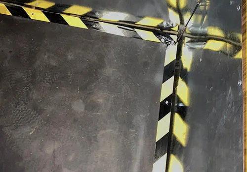
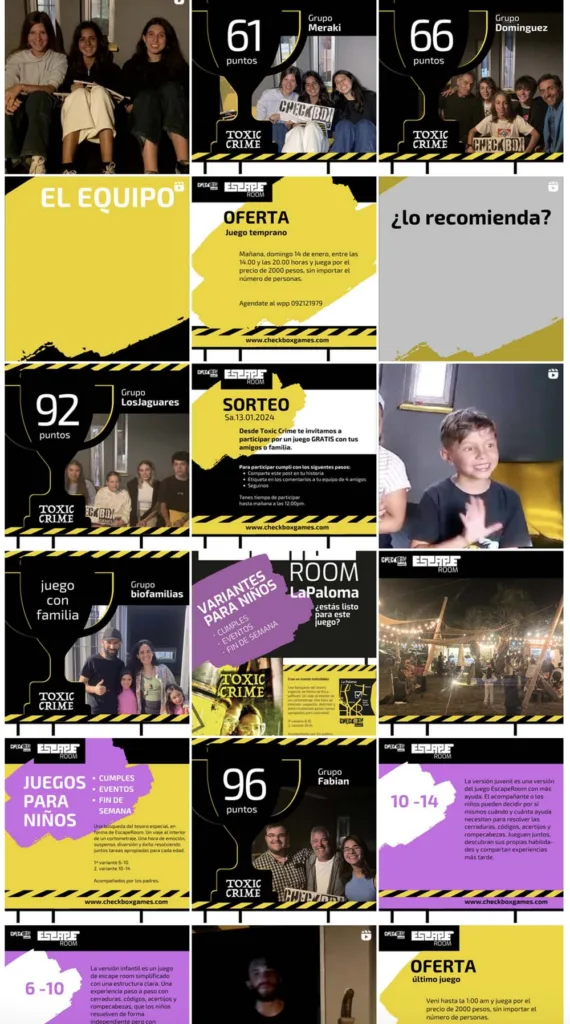
The visuality was supplemented by the color decision heavy yellow (initially based on the theme of the first EscapeRoom), by the labyrinth building blocks (based on the ESCAPERoom logo), and the more specific it is about the EscapeRoom (ToxicCrime), by the barrier tape look. Of course, a concise font should not be missing.
Website:
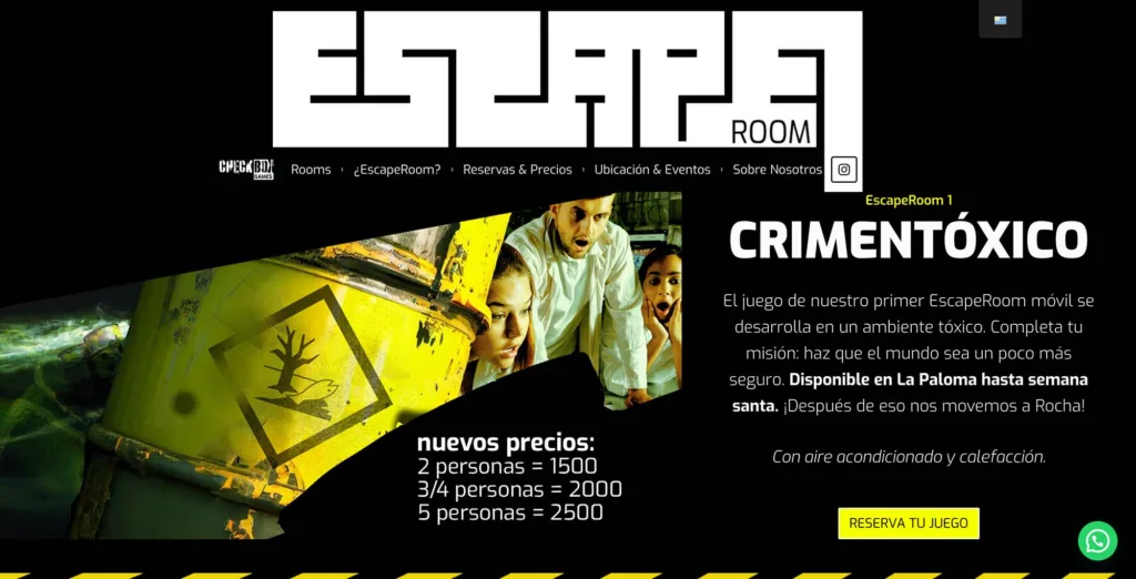
The website was created with the additional possibility of movement and interaction. Initially with the focus on the first product. In addition to the design, the main focus was on a good structure and hierarchy. The game of an ESCAPERoom is not yet very well known in Uruguay, the period is very much related to the vacation season and the planning for operation is difficult to estimate due to cultural differences. The website therefore had to cover many tasks and ultimately encourage bookings.
SocialNetwork:
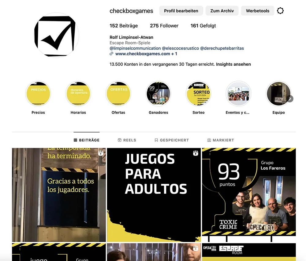
The integration of Instagram, WhatsApp and Google were necessary steps because these are the everyday tools of marketing and contact logistics in Uruguay. In terms of technology and design, a convincing addition had to be set up here.
Print material:
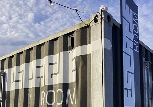
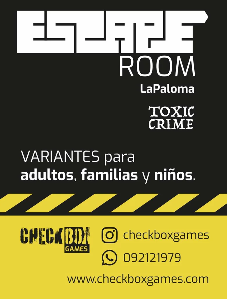
The print material included both the design of the space itself and the outdoor advertising. Flyers, posters, banners, forms, feedback forms … A whole range of products was created. Mostly multilingual and of course in the design line.

Conclusion:
An exciting project with comprehensive diversity and a multi-layered challenge. I am happy with the implementation and extremely satisfied with the products and the feedback.

